Stained Solid Wood Doors
July 23, 2007 § 2 Comments
Many of you, after reading about how garage doors are painted the house color and how front doors should be a stand-out color, have written in about using stained solid wood doors. My comment to that is, whenever your budget allows for solid wood doors, go for it. There’s nothing like the richness of wood, whether it’s a mahogany stained front door or garage doors, to dress up your home.
Avoiding the Clash of Colors
July 19, 2007 § 66 Comments
Every day I drive by this office building, a big brick square structure along a main road. And every day I wince when I see the annual flowers in the huge bed along the driveway. The brick building is, well, brick. It has rusts and browns and taupes and rusty reds and all earth tones. Not anywhere do I see raspberry pink. Call me neurotic about color, but with all the other choices of annuals — red, yellow, orange, purple, blue, cream, and white — they chose to plant a huge bed of hot pink flowers in front of a rusty red brick building. Sorry, but yuck.
It’s nice to consider the color of your home or building when decorating with plants and flowers. You can really enhance the curb appeal by landscaping with colors that coordinate with or compliment the building or house color. At least try to avoid colors that clash.
For that brick building, I would have planted either a big bed of cream and white flowers to add a little life to the dark brick or a bed of purple and blue flowers to give the space a little punch. As the complimentary colors to the orangey brick, the purply blues would make both building and garden look terrific.
Cottage Colors: Back from the Lake
July 5, 2007 § 17 Comments
 My apologies to anyone who surfed over this way only to find empty posts and no comments for two weeks. I’ve been at my dad’s cottage away from all civilization (including my trusty computer) for two weeks. Although it was restful, the pile of emails and assorted communications that went unanswered is daunting. But I’m back.
While I was there, Dad decided to have the outside of the cottage painted. Or at least talk about it. And I had left all my color wheels at home. Why would I need them, I reasoned. Well, boy was I lost without them. I took a jaunt to the closest Home Depot and stood there in front of all the color swatches, just like many of you have been doing. I too was overwhelmed by the choices. Somehow with my own color wheels from all the various paint companies, I can maneuver through the myriad choices landing on the ones that I know will work. But in front of this maze of marketing displays, it was color overload. I grabbed a handful of paint chips and bolted for the door.
Back at the cottage, the process took shape. We decided on dark green trim for practical reasons. The spider droppings are black and show up on light trim. With a dark color, you don’t have to scrape the black spots off as often. Terrific. (I verified this by wandering over to a neighbor’s cottage that had white trim. Yup. Black spots.) Then we decided to go with a medium green for the body. Again for practical reasons. It will blend with the dark trim and not stand out very much. The surroundings are all green, of course, and the cottage will blend in. Just as Dad wants. Nothing flashy for this cottage. It’s pretty rustic. And the orange daylillies will really look sharp against the green backdrop.
When you’re choosing cottage colors (or colors for any dwelling that’s buried deep in nature’s colors), stick with colors that appear in nature. They don’t have to be greens, but taupes and tans and natural stone colors work great. As do darker blues and browns. Keeping to colors you find in your landscape will leave the vista uninterrupted to the eye. The cottage will look like it belongs right where it is.
Stone and Blond Brick House Trim Colors
June 20, 2007 § 261 Comments
 When you’re dealing with natural materials, I like to stay in the earth tones for trim color. And there’s nothing more striking than a dark wood door on a stone facade. For me, it just conjures up images of castles and old English cottages. Choosing colors that come out of the natural variation in the stone or brick makes the most sense to me. Yes, we’re talking creams, taupes, and tans. But depending on the tones in your stone or blond brick, you could lean in the clay red direction or chocolate brown.
Keeping the house natural may seem blah, but that’s the way the house would look if it were built centuries ago. Don’t ignore the roof color though, and if you’re choosing a roof for a stone or brick house, I would avoid a lot of color variation on the roof. It will look really busy if the roof is not a solid color. Some people like that — but I get migraines.
Keeping Up with the Joneses’ House Colors
June 18, 2007 § 8 Comments
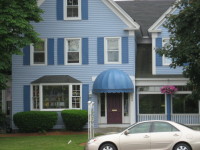 Businesses need to attract attention and this day spa does so in a good way with a very pleaseing cornflower blue color scheme. Some over-55 communities also have similar colorful palettes for their house colors. The builder chooses the colors, of course, but they all go together nicely. One community in New England I saw advertised in the Boston Globe had very brightly colored homes, from sunflower yellow to peacock blue. That’s terrific.
If you live in a community (particularly new construction where you’re not concerned with historic palettes) in which all your neighbors are painting their houses bright colors, and you’d like to follow suit, go for it. When I mentioned in previous posts that your house should fit into its environment, those brightly colored neighbors’ homes ARE part of that environment.
The problem comes when your neighbors all have traditional home colors, white, grey, khaki green, colonial blue, and we come upon YOUR house in a neon salmon. We all like to march to our own drummers, but sometimes it just doesn’t look good. You get the picture.
Choosing a Tasteful House Color
May 7, 2007 § 66 Comments
I do a lot of driving. And as a decorator, what I find myself doing for much of the time is looking at house colors and analyzing them. From Upstate New York to Massachusetts, I’ve seen everything from spearmint green to black. Some colors really work and by that I mean that they draw your eye to the house and the surrounding landscape, but they allow your eye to move on. Other colors draw your eye directly to the house colors themselves and you don’t notice anything else. And you find yourself staring at the color and wondering, “What were they thinking!!”

Here’s what I suggest when it’s time to choose an exterior house color. This is particularly important if you’re selecting permanently installed siding as you’re stuck with the color for 20 years or more.
1. Look at nature. If you live in Florida, nature gives you everything from wonderful pastel shell tones like light pinks and peaches to bright hibiscus reds. And the sky and ocean provide the cool side of the palette. So when you’re choosing a house color, select colors that you see in your surroundings. A bright coral house in Florida looks perfectly acceptable because the color appears naturally in that environment.
If you live in Wisconsin or Vermont, however, that’s a different story. Nature in the north gives you earth tones like browns and olive greens and rust and even black. Spearmint green really stands out against a backdrop of evergreens and that’s not a good thing. So when you’re choosing a house color in New England, choose a color and a hue value that appear in nature. That would not include bright turquoise but might include a grayed-down slate blue like Benjamin Moore’s Jamestown Blue (HC-148).
2. Look at your neighbors. It’s the reverse of “keeping up with the Joneses.” You do not want the same house color as your next-door neighbor even if he stole your favorite color.
3. Respect history. If you live in an old house, choose a color that might have appeared on the original. There are many colors in the historical palette, but there are several that are not. When in doubt, stick with the tried and true historical palette, such as Benjamin Moore’s HC colors. This tasteful array of hues suits most homes, especially traditional style colonials, old or new. Richmond Gold (HC-41) looks great with black shutters and cream trim. And the greens, such as Louisburg Green (HC-113) blend beautifully with natural surroundings.
4. White works. White homes have a presence, a traditional elegance that fits in many historic areas. But in the winter, they either get washed out or they look dirty gray. White works if you keep up with the paint job and keep the house’s exterior clean. Be sure to add color with your door and landscape plantings. And black or dark green shutters.
5. Victorians follow their own rules. If you live in an old Victorian home, do some research and discover all your color combination options. All rules of conventional taste can be broken when you’re highlighting the detailed trim on an old painted lady.
6. Where to use purple. There’s an old brick house in Cambridge, Massachusetts, with a dark purple metal roof and dark purple front door. The combination is quite stunning. Purple is great as an accent color on front doors, wreaths, and landscape plantings. A little purple can go a long way, but used carefully, it’s a great color.
7. Blend or be seen. The bottom line for house color is to decide whether you want your house to blend tastefully with the others in the neighborhood or stand out as the focal point on the block. If you decide to go off the natural palette and opt for a crayola-bright color, consider using that hue for a door color or some other accent instead of the house color. You’ll make just as big a statement and stay within the realm of good taste.
One more thing. House color is important to your children. When I was away at camp one summer, my parents painted our house orange with green shutters. (Orange was supposed to be gold but the paint store messed up and my parents did not have the color sense to stop the presses.) Horrified is the word to describe my shock when I returned from camp. From that point on, my house was known and identified around town as “the pumpkin house.” Don’t do that to your children!
Follow the guidelines and select a paint color for your home that will show your good taste and make your home look its best.
